My work is presented in 3 different phases
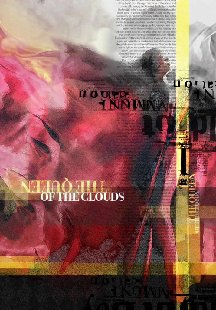
Iemanjá! First Concept
My starting point for the concept was, initially, ‘the queen of clouds’. I was inspired by the Brazilian goddess ‘Iemanja’, the queen of the sea and I was also fascinated by the ‘appreciation’ ceremony which the fishermen with their families celebrate every year. This involves offering their flowers to the queen and scattering them all over the sea.

However, because of the Covid-19 pandemic and the global lockdown, I decided to change my concept and create something totally different which is linked to the current situation. The idea started from home, the place where everybody is spending a lot of their time due to this lockdown.
Phase one
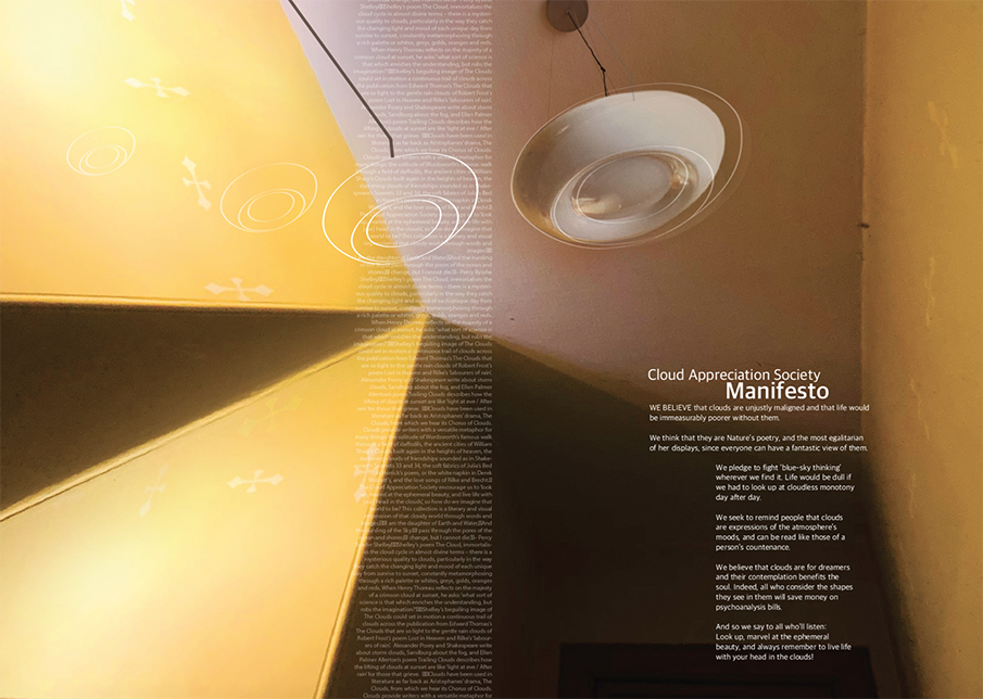
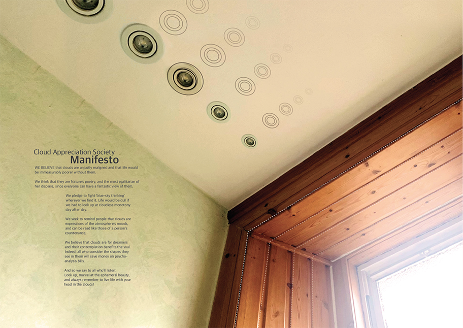
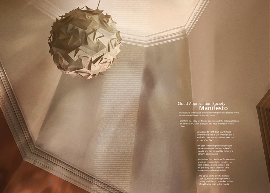
Worm eye view
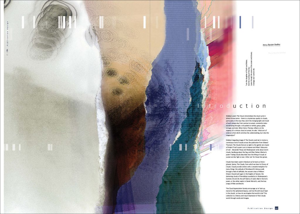
A worm eye view is when we look upward and, in this case, looking up at the clouds.
From this perspective, I started to search for artists who use the ceilings, or the entire space, of an exhibition rather than just the walls to show their work. I came across 3 different artists.
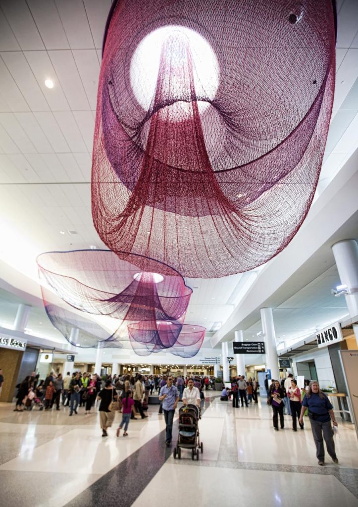
One of most interesting and attractive works is by Janet Echelman.
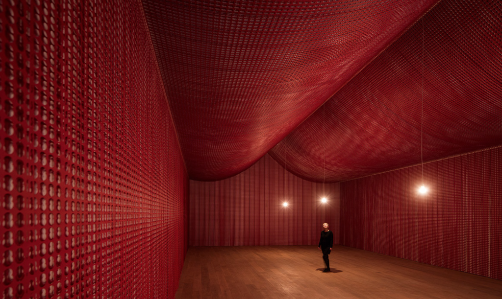
Janet Echelman
Janet Echelman is an American artist. She created her art from fibre materials, and she chose the ceiling as the main surface to display her creations.
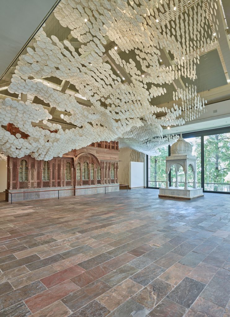
Jacob Hashimoto
Next, there is a fascinating work by the American artist Jacob Hashimoto called ‘Clouds and Chaos’. This project is an installation that which hung from the ceiling and represents clouds and chaos from his unique point of view.
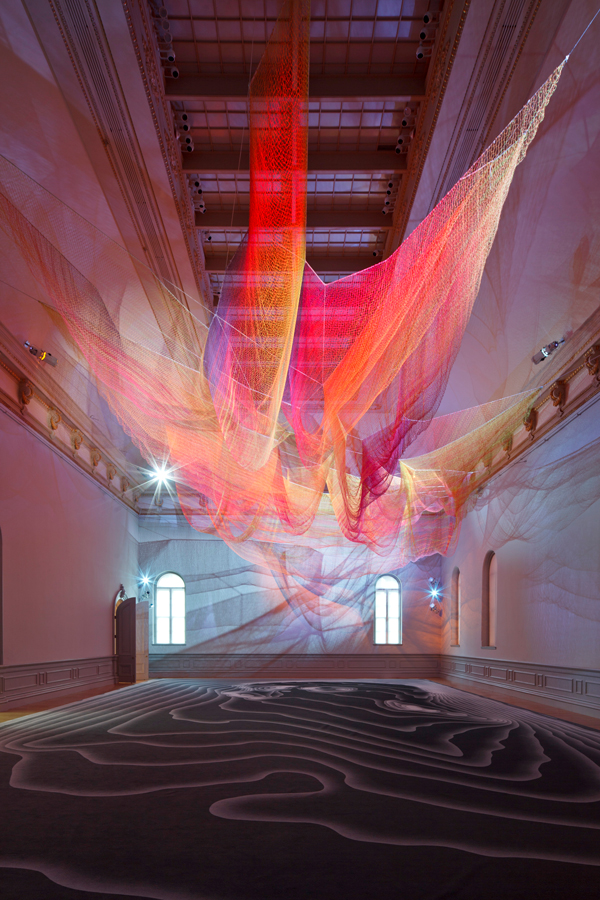
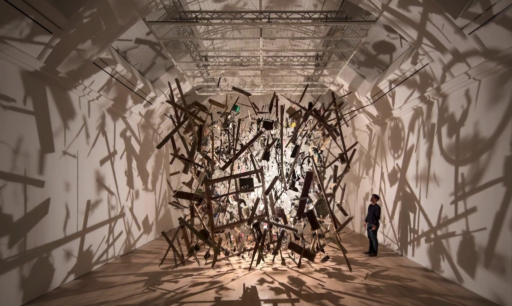
Cornelia Parker
Cornelia Parker is an English visual artist and best-known for her sculpture and installation art. She uses the entire wall-space right up to, and including the ceiling to display her work. This is a stunning combination of fabric, light and shadows and it lets us look all around her exhibition space in wonderment.
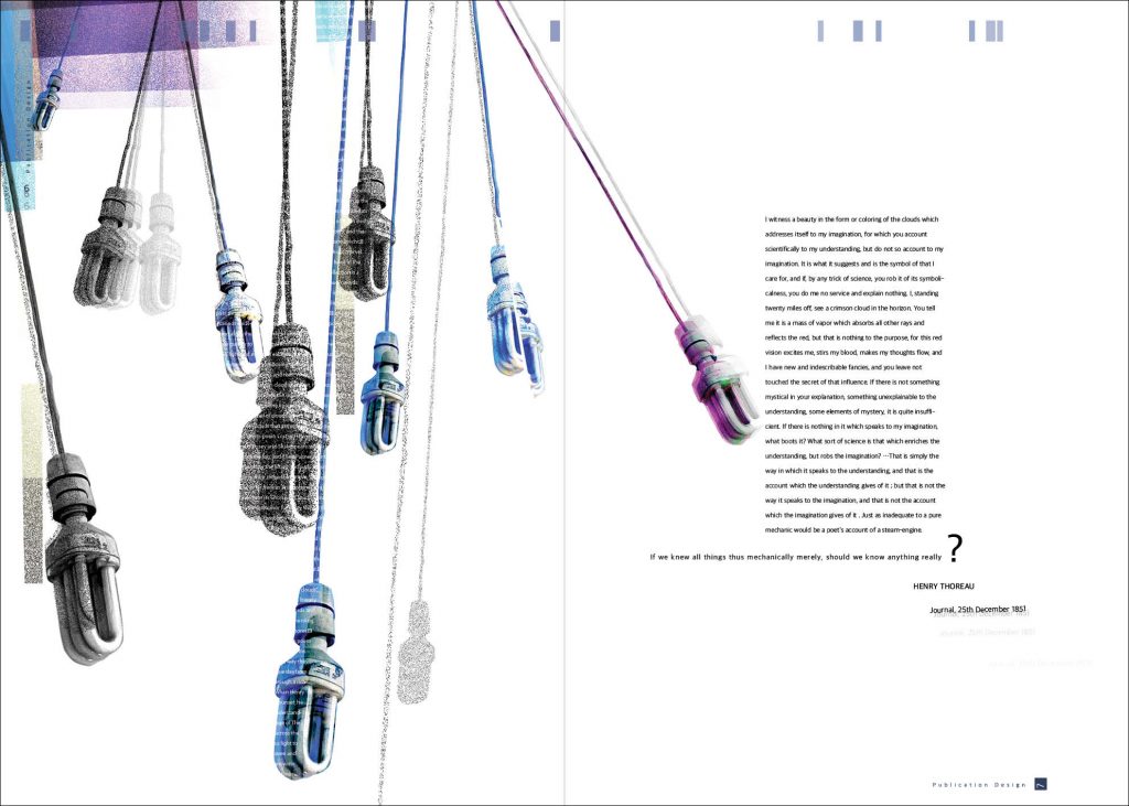
From the worm’s eye view, and since we are spending much of our time indoors, I have considered that the ceiling, with its pendants, chandeliers and lamps, is a projection of the sky with its clouds. This also involves experiencing the light and its dazzling reflection.
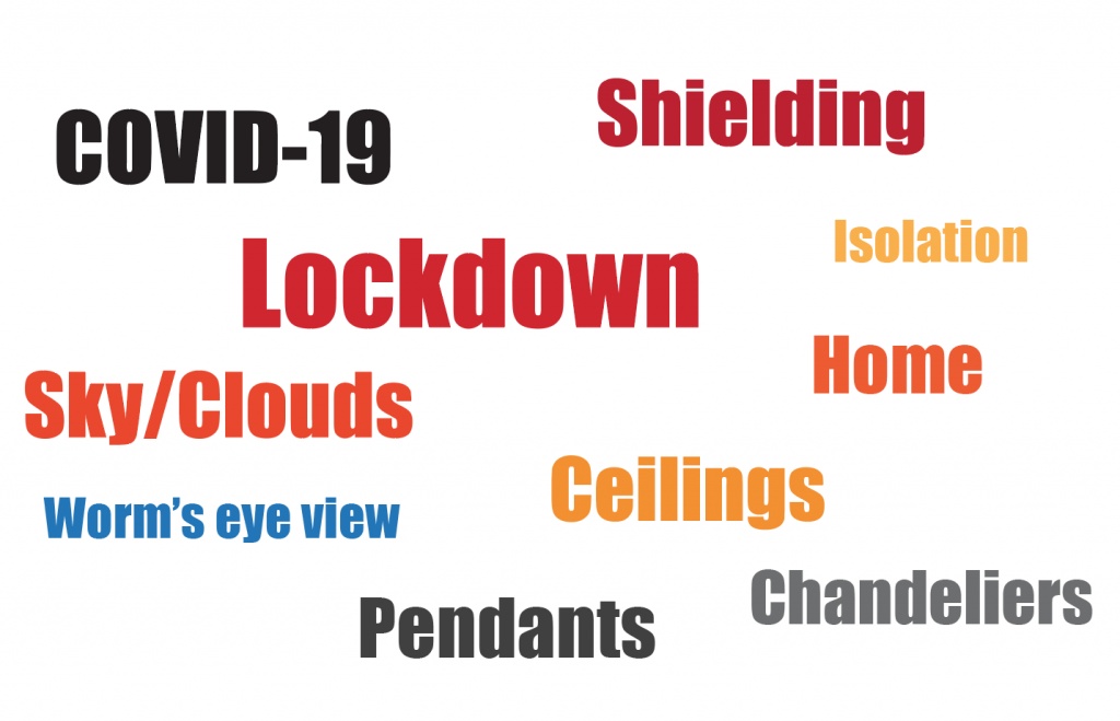
Here is a mind-map on which I started to put things on paper and bring points together.
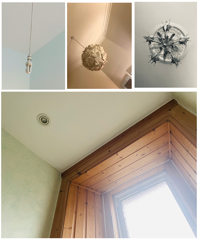
Following this, I started to take photos of the ceilings in every room and in every corner of my home.
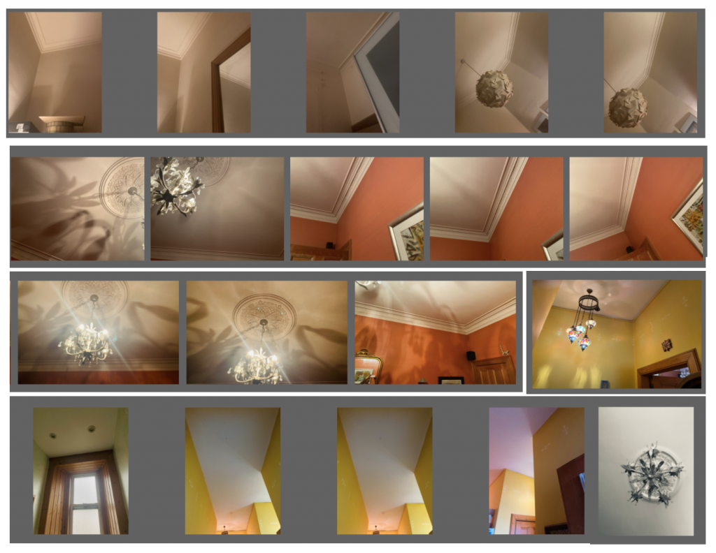
After I collected a variety of images, I did some photo manipulation by using Adobe Photoshop. The result was simple, basic images perfectly suitable for commercial home decoration brochure.
Phase two.
In this phase, I expanded my research by focusing and taking into consideration the mental health issues which most people are experiencing these days due to the tough endless lockdown and being isolated at home. From the NHS website and the ONS (Office of National Statistics), I found that the most commonproblems of isolation are loneliness and anxiety.
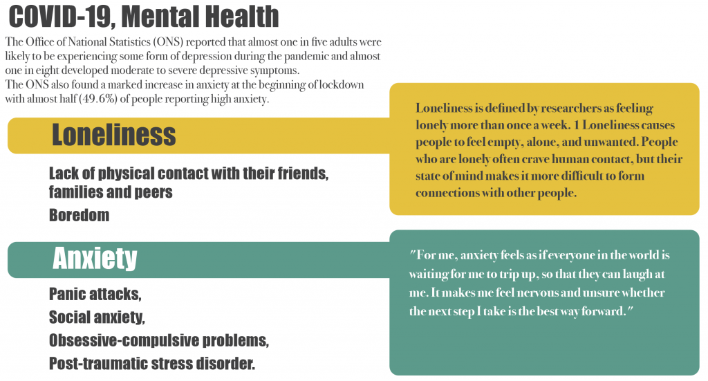
I started to connect all the symptoms of loneliness and anxiety with my ceiling photos. These symptoms include obsession, compulsive behaviour, confusion, dissociation, delusion, fear, uncertainty, alienation, hesitation and mental imbalance.
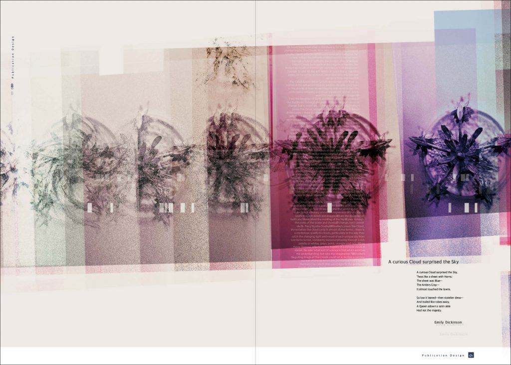
Then, I went to the next level by creating different visuals. These visuals reflect the symptoms of loneliness and anxiety by deconstructing my previous designs and using repetitive elements which create blurry and fuzzy effects.
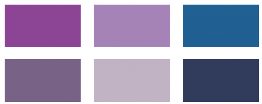
The colour palette that I used reflects current mental health issue. It is a combination of blue, purple and violet.
Phase three
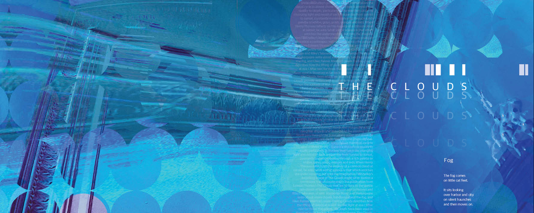
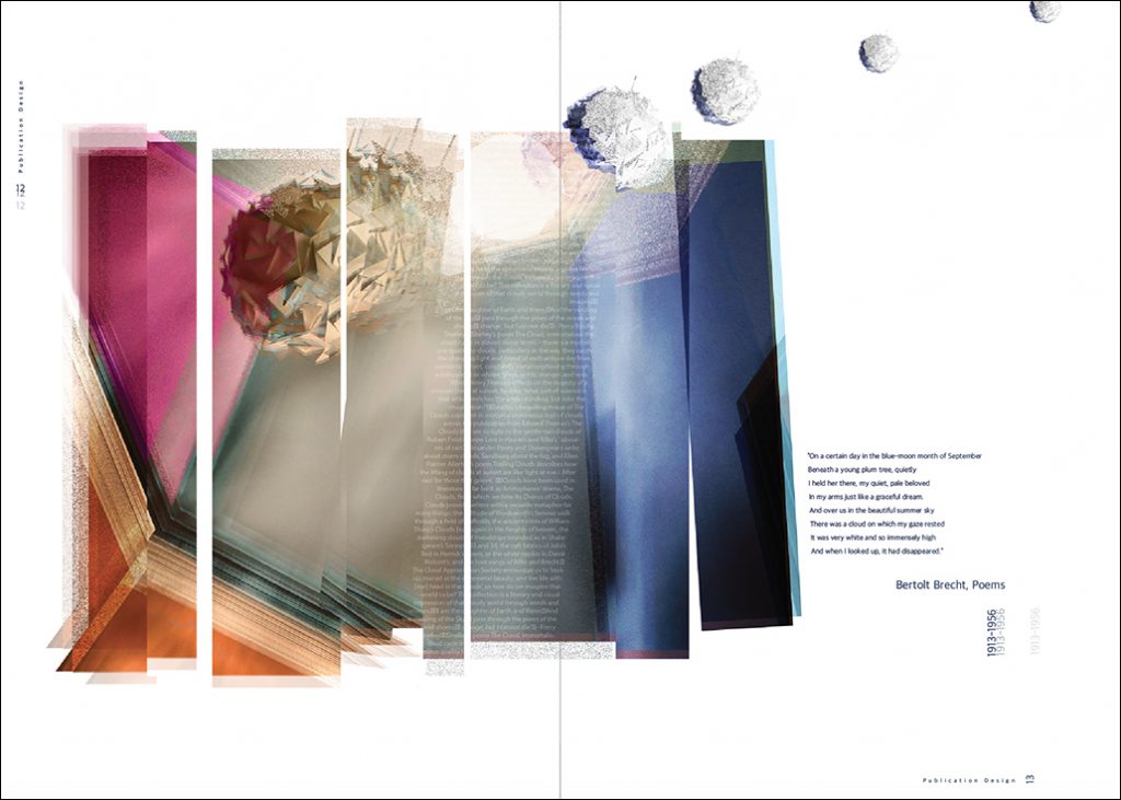
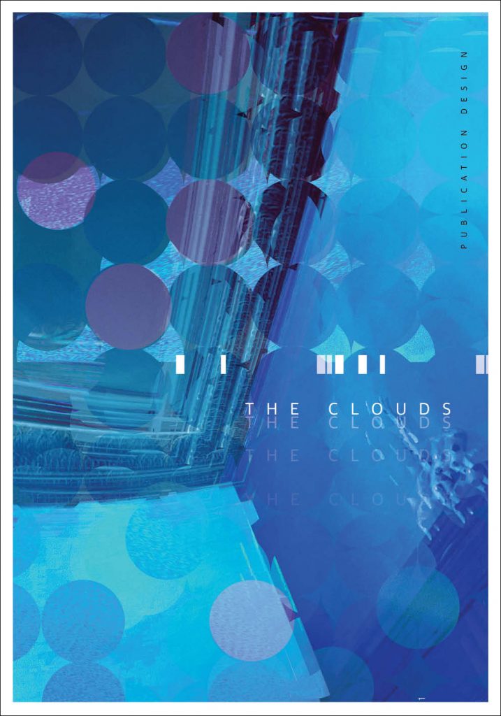
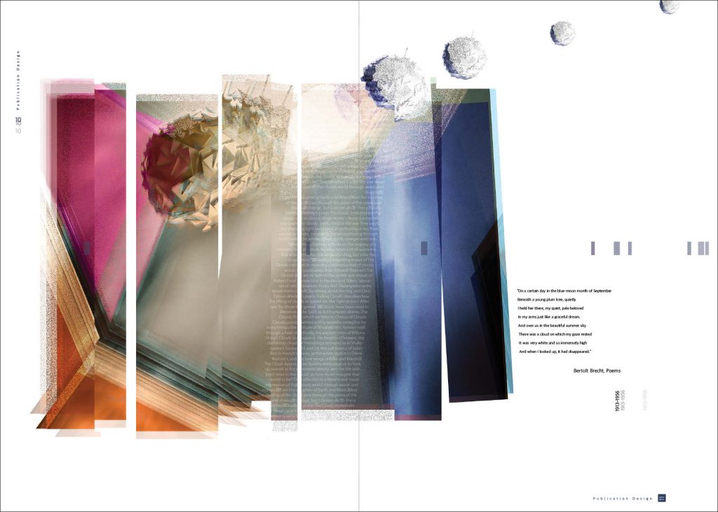
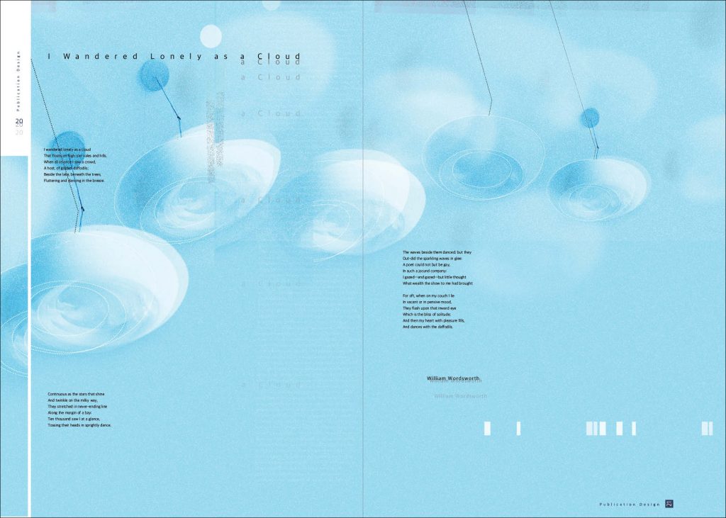
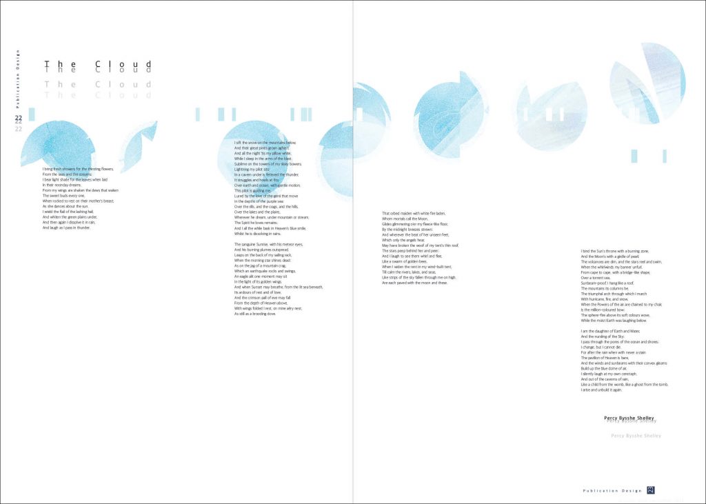
My third step is to bring the outside to the inside. Moreover, its purpose is to reflect the sky, the clouds and the beauty and joy of springtime on my ceiling. I began to use a new light palette based on different shades of blue. This uplifting palette mirrors the positivity, the lightness and the sense of freedom conveyed by the clouds.
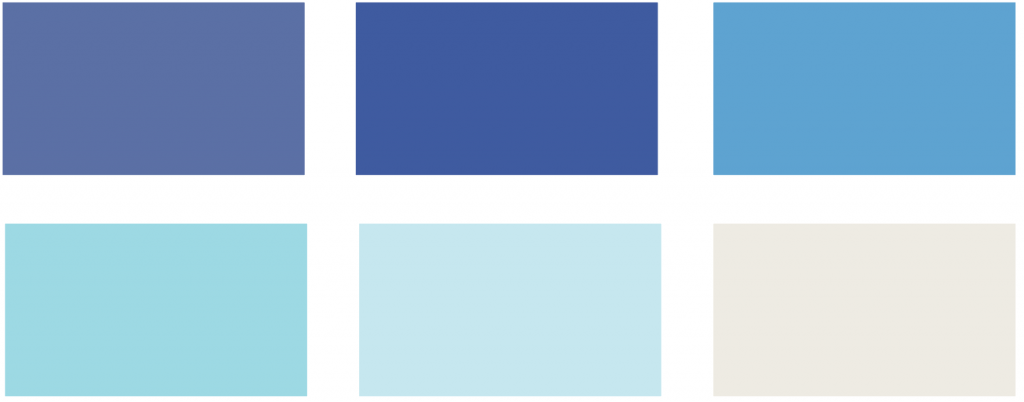
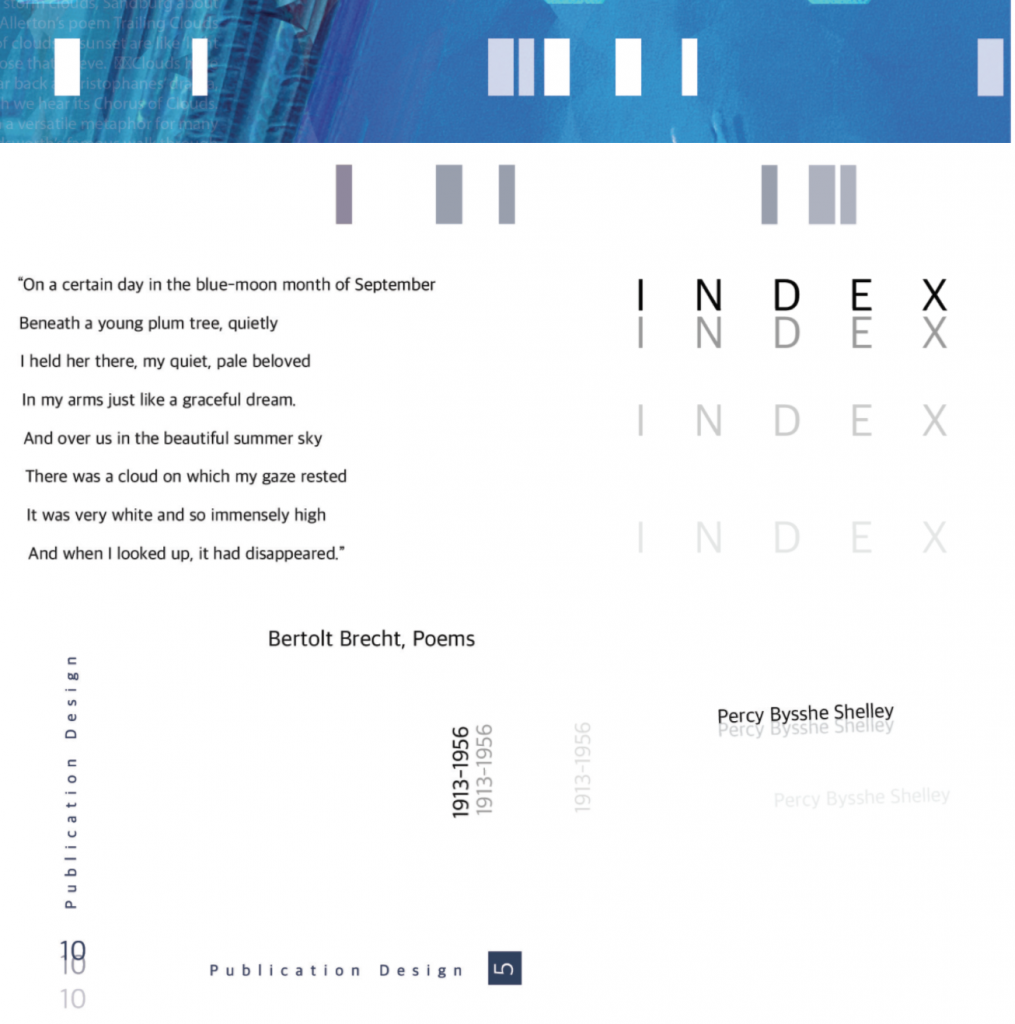
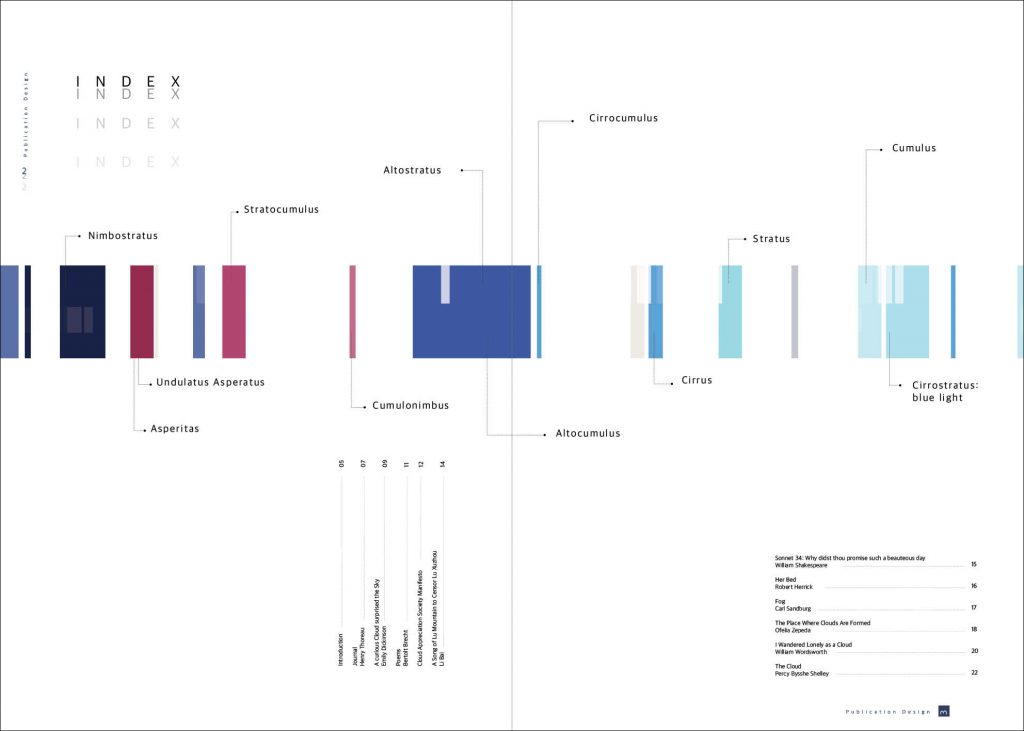
The index of the publication is where I show the progression in colours from dark to light, from negativity to positivity.
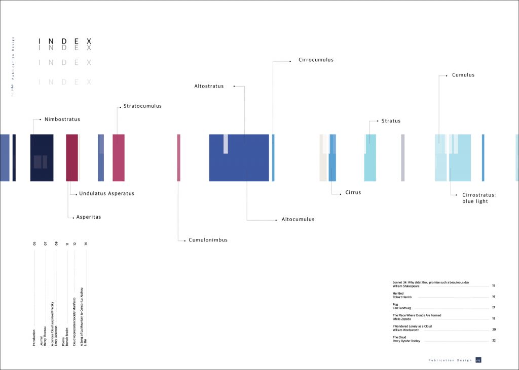
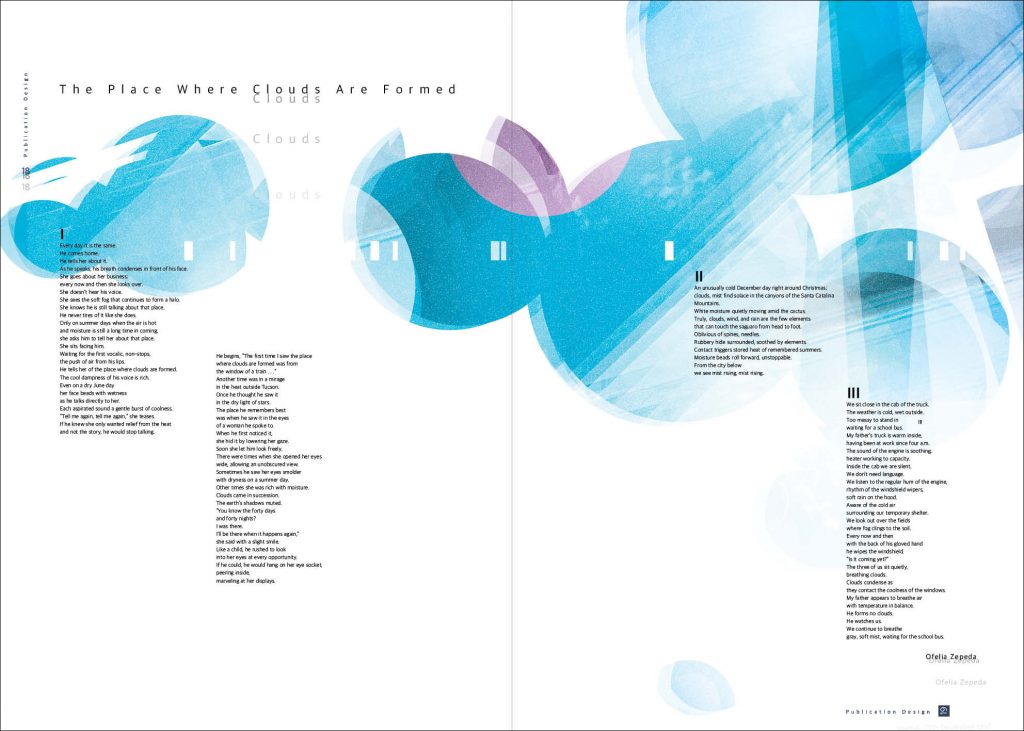
I worked on small details, such as the pagination and the repetitive patterns on each page. These details, including the colour palettes, create a consistency and coherence throughout the entire publication. In addition, I used a thin sans serif font ‘Apple SD Neo’ to balance the strong visuals and the text. The negative space was also important, and it varies, in my design, between one page and another.
Finally, my publication is a journey that is represented in shapes and colours. It’s a journey from negativity to positivity; from pessimism to optimism; from lockdown to freedom; from inside to outside, from dark to light; from the sharpness of the square to the smoothness of the circle.
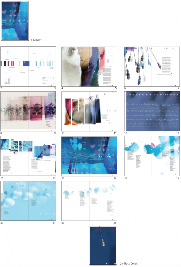
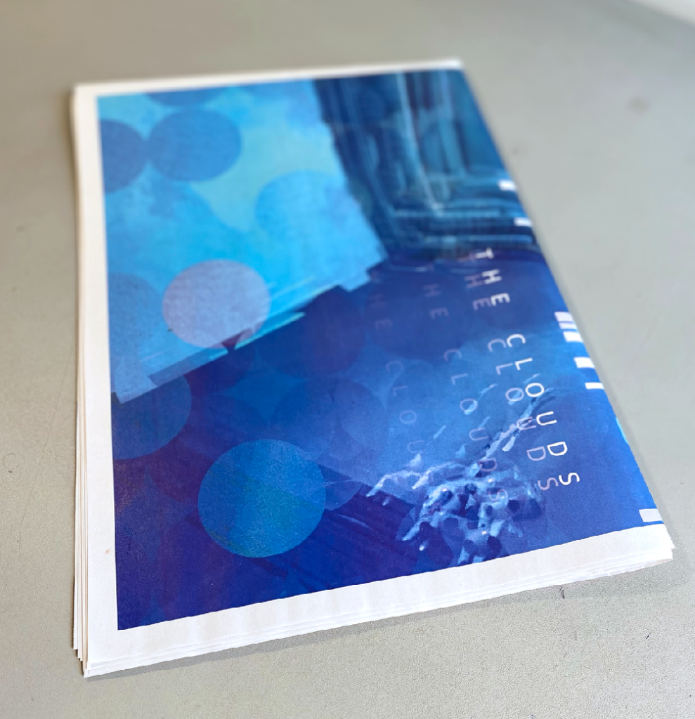
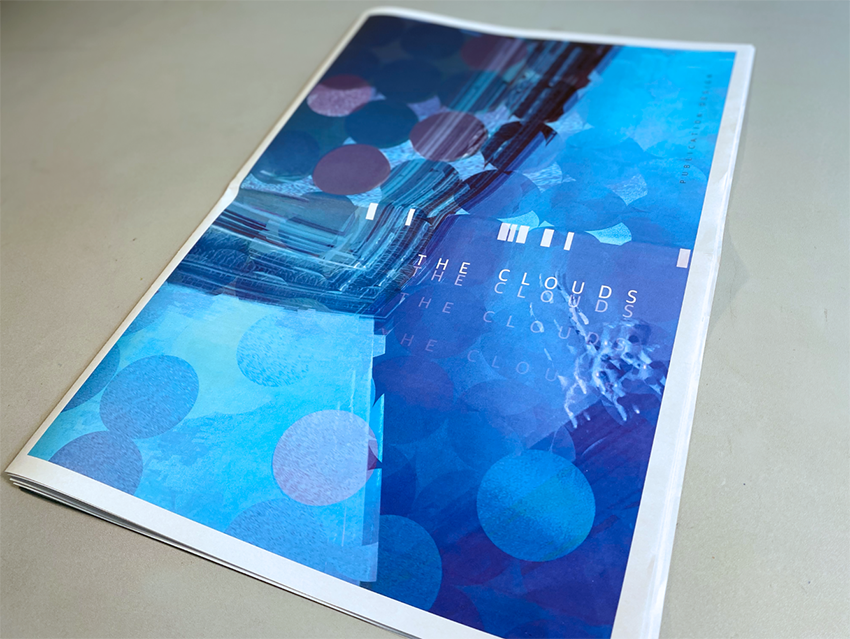
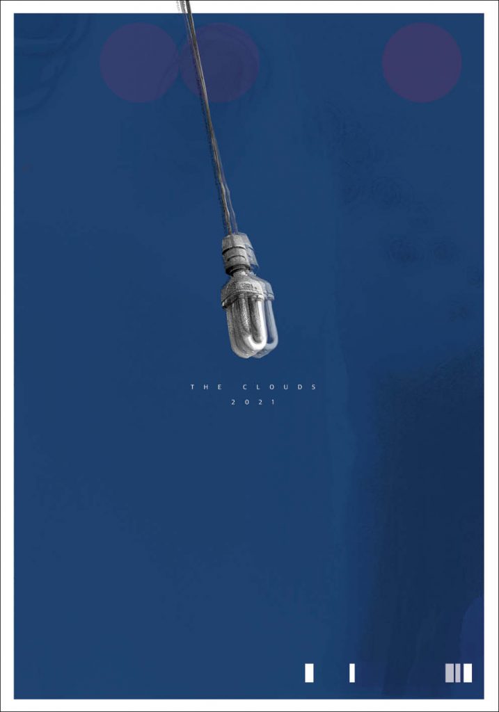
Final Publication
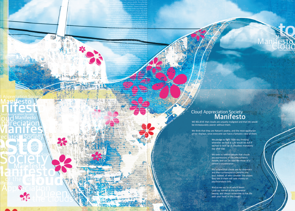
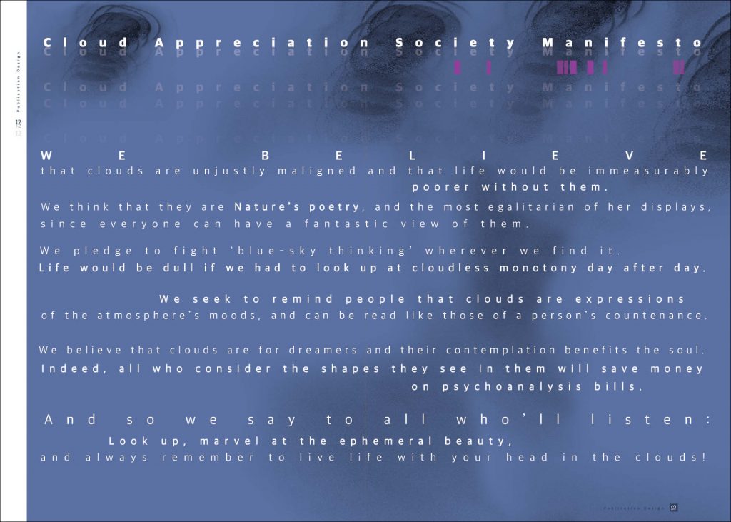
To make the Manifesto bold, I used a dark background with a big size text. This spreadsheet is in the middle of the publication where there is no spine. I used the entire sheet to place the text.
The Printed Version